Visual Brand Application
Nintendo Bags
Exploration and learning how a brand represents themselves can be both fun and challenging.
Applying that brand language or VBL, to a product the company doesn't make can take that challenge to another level. The way one applies a brand's VBL can either make a product look like it's right at home, or not even associated with the name.
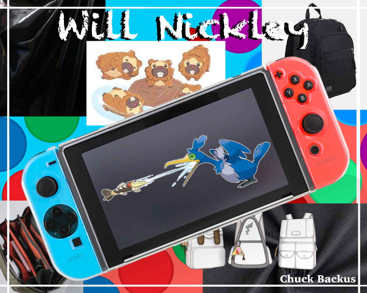
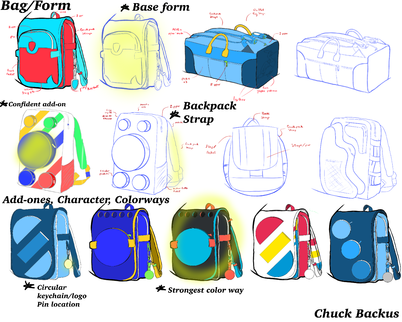
Before applying a brand's language, you first have to break down and figure out what that brand makes you feel, what vibes they give off, what is unique to them that other brands and companies aren't emitting off in their work.
For Nintendo, it's their bright colors and organic forms that separate them from many other gaming or console brand.
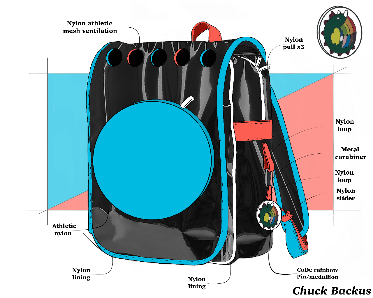
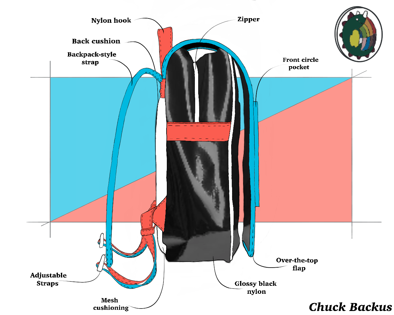
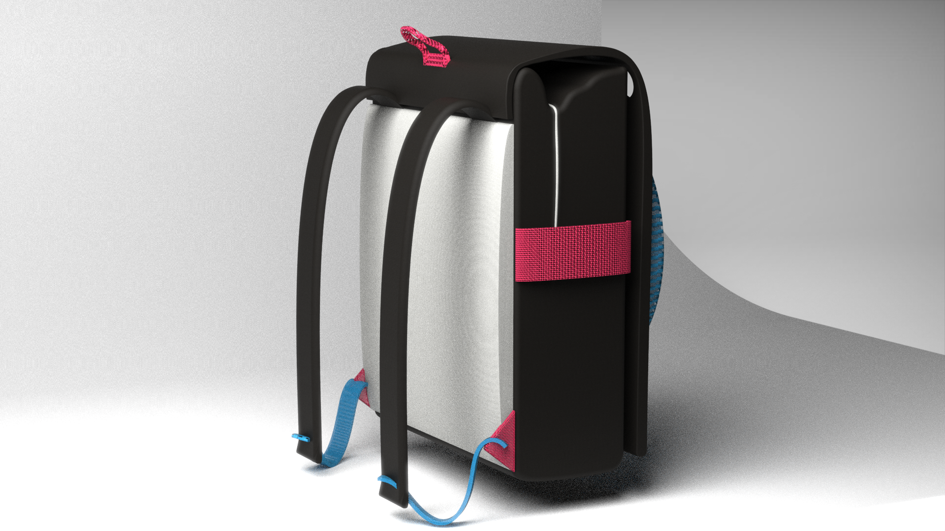
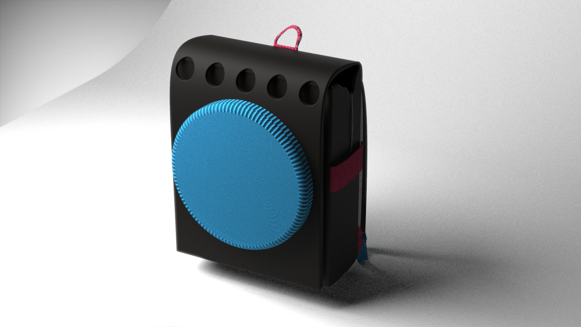
Standing the Test of Time
Nintendo in itself as a company has been around for almost 150 years. So, how have they continued to have a high level of success for so long? Both their games and the way they portray themselves have continued to improve while staying true to their roots and that was the goal of this visual brand exploration. Taking a simple soft good found everywhere today and making it so that when someone sees it they can instantly relate it to being a Nintendo product. While having multiple character-verses and console unique in themselves, the Nintendo Switch was the one used as inspiration as it's their most recent console released. Keeping a simple color base while adding the bright color you see on the switch to appeal to both the younger and older generations while staying true to how they brand their own products.
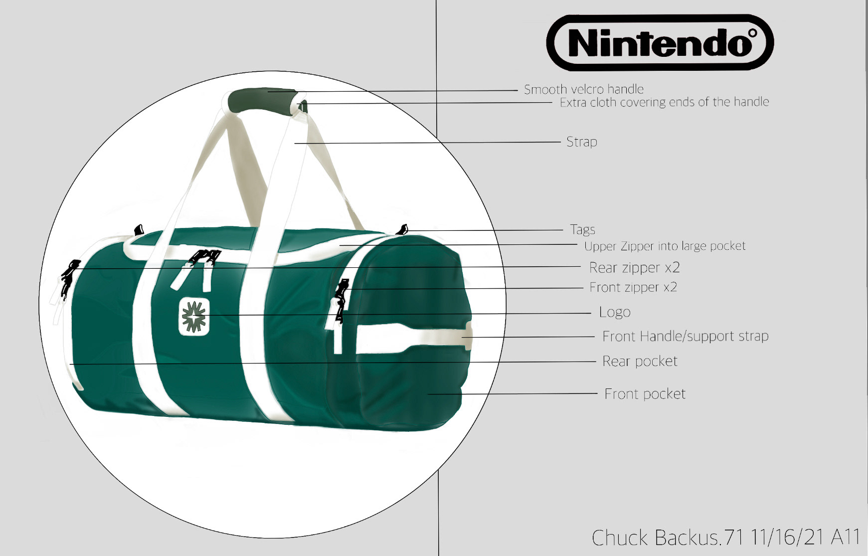
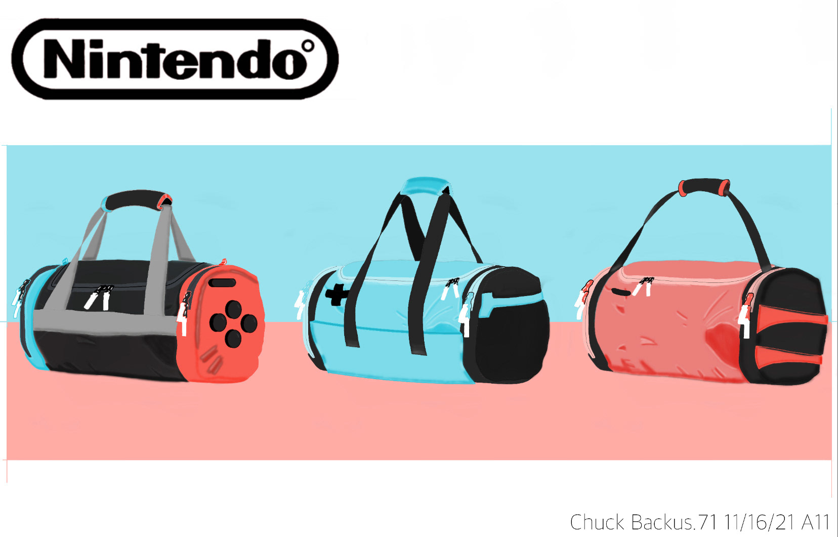
Application